A birthday card can be sweet, silly, sparkly, or all three before the envelope is even opened. That is why stationery design trends matter: they turn everyday paper goods into tiny moments of personality. The freshest looks are not about following one strict aesthetic. They are about choosing art, color, and words that make the recipient feel seen.
For card shoppers, party planners, teachers, and notebook collectors, the best trend is always the one that fits the moment. A bold joke may be perfect for a best friend, while a soft botanical thank-you card feels right after a wedding or thoughtful favor. Here are the styles bringing more character to mailboxes, desks, classrooms, and gift bags.
Stationery Design Trends to Watch
1. Cheerful maximalism is having a moment
Minimal designs still have a place, especially for formal correspondence and professional stationery. But playful abundance is winning hearts in birthday cards, stickers, school supplies, and party paper. Think colorful checkers, wavy borders, smiley faces, stars, hearts, tiny flowers, and fun patterns layered together with purpose.
The key is controlled energy. A card can have plenty going on without becoming hard to read. One large message, a clear focal illustration, and a limited color family help lively details feel intentional. This style works beautifully for kids, teens, and anyone who believes a little extra joy is never a bad idea.
2. Cute characters bring instant connection
Animals, food with faces, happy little objects, and delightfully odd characters continue to make stationery feel more personal. A dog wearing a party hat or a slice of cake with big celebration energy can say, “I picked this for you,” without needing a long message inside.
Character-led designs are especially useful when shoppers need a card quickly but still want it to feel specific. Pet lovers gravitate toward dogs and cats. Gamers appreciate references that match their world. Younger recipients often love a little internet-aware humor. The best character art is expressive enough to be memorable, yet flexible enough to suit a real occasion.
3. Bold typography is doing more of the talking
Big, confident type is no longer just a supporting detail. On many standout cards, the words are the main event. Phrases such as “You Did It,” “Thank You,” or a cheeky birthday line can fill the front in colorful bubble letters, retro serif fonts, hand-drawn scripts, or punchy all-caps.
This trend is all about visual voice. A handwritten-looking message feels warm and casual, while clean block type can feel modern and energetic. The trade-off is readability. A clever phrase only lands if people can read it at a glance, so busy lettering needs enough contrast and breathing room around it.
4. Retro color palettes feel fresh again
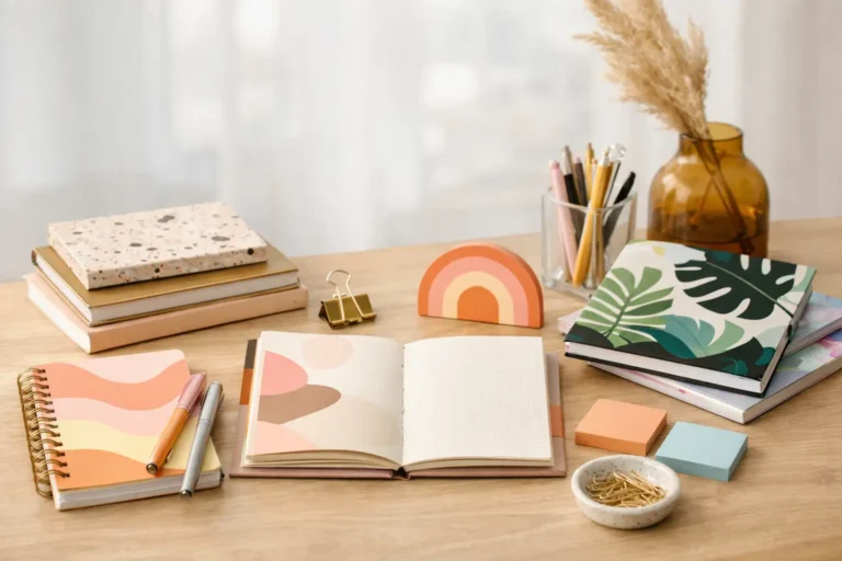
Stationery is borrowing from several favorite eras at once. Warm oranges, avocado greens, dusty pinks, cobalt blues, sunny yellows, and deep cherry reds are showing up in combinations that feel nostalgic without looking dated. Checkerboard patterns, groovy flowers, striped borders, and slightly imperfect hand-drawn shapes add to the throwback charm.
Retro does not have to mean muted. Some of the most eye-catching designs pair vintage-inspired motifs with bright, modern color. It is a great fit for birthdays, housewarming cards, notebooks, and party supplies because it feels familiar, upbeat, and easy to gift.
5. Florals are becoming bolder and more graphic
Florals never disappear from paper goods, but the current direction is less about delicate realism and more about statement-making illustration. Oversized daisies, loose painted blooms, clustered wildflowers, and simplified petals can frame a sentiment or cover a notebook with color.
This is one of the most versatile stationery design trends because it can move from sweet to sophisticated so easily. Tiny pastel florals are lovely for baby showers and thank-you notes. High-contrast blooms in rich colors give birthday cards and planners a stronger, more contemporary feel. For formal moments, a restrained floral border can offer personality without taking over.
6. Personal-feeling humor beats generic messages
The card aisle is becoming more conversational. People want greetings that sound like something they would actually text a friend, sibling, coworker, or partner. That means specific jokes, modern references, honest little messages, and gentle sass have a real place beside traditional sentiments.
Humor has to match the relationship. A wildly silly card may be exactly right for a close friend but not for a boss or a distant relative. Keeping a mix on hand makes gifting easier: choose heartfelt for meaningful milestones, funny for everyday laughs, and somewhere in between when you want both. A well-chosen joke can make a simple birthday or thank-you feel like a shared memory.
7. Texture and special details make paper feel gift-worthy
Digital communication is fast, but physical stationery earns its place through touch. Foil accents, embossed details, matte finishes, textured stock, die-cut shapes, and layered illustrations all make a card feel more like a small keepsake. Even a simple design feels elevated when the paper has a satisfying weight.
Not every occasion needs a premium finish. Bulk thank-you cards, classroom notes, and everyday correspondence benefit from being affordable and easy to use. Save extra-special details for weddings, milestone birthdays, graduation, or a message you know will be displayed on a shelf. The right finish should support the feeling, not make the card too precious to send.
How to Make the Trends Work for Real Life
Trends are most useful when they help you choose faster. Start with the recipient and the occasion, then let the design do some of the emotional work. For a child’s birthday, bright characters and big lettering create instant excitement. For a teacher thank-you, cheerful florals or a warm illustrated message feel thoughtful without being overly formal. For a work celebration, clean typography and a light, friendly joke usually strike the right balance.
Building a small stationery drawer also makes these styles easier to enjoy. Keep a few birthday cards, blank notes, thank-you cards, celebration stickers, and gift tags ready for the moments that sneak up on you. Mix practical multipacks with a few designs that feel wonderfully specific. You will have something ready for a last-minute invitation, a thoughtful care package, or a just-because note.
For party hosts, matching every item perfectly is no longer the goal. Coordinating colors or one repeated motif can look more fun than a fully identical set. Pair a floral invitation with striped napkins, or use bright character stickers to add personality to simple favor bags. This approach feels creative, approachable, and less stressful when you are planning on a real-life timeline.
Choose Paper Goods That Feel Like You
The most shareable stationery is rarely the most serious. It is the card someone pins to a bulletin board, the sticker that makes a water bottle happier, or the notebook that makes Monday’s to-do list a little less gloomy. At Gooji Paperie, original illustration and accessible formats help turn those small choices into more reasons to celebrate.
Pick the trend that makes you smile first. A funny card, a bold floral notebook, or a stack of colorful thank-you notes can be a small reminder that everyday connection deserves good design.
